
Interior Design – Why you need to appreciate it! – Part One
In March and April 2016, The Builders’ Garage published Part 1 and Part 2 of an article, which profiled the experience of Kagoya Clara (a former student of Architecture) as she navigated her way through her undergraduate degree programme. In a sequel to our last meeting, we recently caught up with Clara, to share with us her practical experience related to interior design.
Taken off wikipedia (the free encyclopedia), interior design is the process of shaping interior spaces, through the manipulation of spatial volumes and the treatment of surfaces for the betterment of human functionality.
Interior design is the process of shaping interior spaces, through the manipulation of spatial volumes and the treatment of surfaces for the betterment of human functionality.
In this article, Clara takes us on a journey, which started when she was 16 years old to date, where she is handling interior design projects for real life clients. As you read along, you will discover a few reasons why you need to appreciate interior design and some of the challenges that interior designers encounter as they go about their professional work.
Clara, when did this start for you?
Around the age of 16, I started watching a television show called Extreme Makeover Home Edition. In it, I would see a team of design professionals specializing in different areas of built environment, working together to transform dull and cluttered spaces into lively and spacious spaces. Houses were customised to the requirements and specific needs of different families. The home makeovers were done in about a week. I was amazed by not only the speed with which they made decisions and implemented them, but by their understanding of user needs and the creativity with which they brought their ideas to life.
A cocktail of tools were employed i.e. colour, furniture selection, placement, scale, abstraction of form, texture, lighting, hierarchy of functions, that sort of thing. That a chair wasn’t just a thing to sit on, but could be a centre piece that draws attention to a space, or an ordering element for the rest of the things in the room, that the shape and size of a ceiling lamp could make a space feel larger or smaller, things like that fascinated me. I also enjoyed the constraint of them dealing with existing buildings; how they used the existing as a canvas for design ‘magic’.
That a chair wasn’t just a thing to sit on, but could be a centre piece that draws attention to a space, or an ordering element for the rest of the things in the room, that the shape and size of a ceiling lamp could make a space feel larger or smaller, things like that fascinated me. I also enjoyed the constraint of them dealing with existing buildings; how they used the existing as a canvas for design ‘magic’.
Did you take your love for art and this programme further?
When I was 17 years of age, I decided that I wanted to pursue interior design as a profession. Unfortunately, I soon discovered that interior design was not offered at any of the local universities I knew.
At the time, it was out of the question for me to study abroad, my parents being uncomfortable with letting me be very far away from home on my own. So, I had to study something that was available locally. While looking through a certain university prospectus about a year later, I discovered Architecture. I was not hearing about it as a discipline for the first time, but I had never looked through what it entailed with as much detail as that prospectus had.
While I perused through it, I realized that it was not only interior design that I had grown so interested in but also the whole building from start to finish, inside and out.
How did your undergraduate programme go?
Architecture school was an adventure, the toughest of my academic years without a doubt, and the most engaging and rewarding. Even though interior design was not its focus, we got to exercise and soak in many of the same principles.
From year one to three we were constantly being grilled in the meaning and application of concepts in relation to design solutions, and how to work with material, form, rhythm, scale, texture, figure and ground relationships, colour, hierarchy, to mention but a few, all developing in us an eye for good composition coming from an informed standpoint. We were dealing with these principles at perhaps a much larger scale but they would be indispensible when we eventually tackled interior design as a course unit in the fourth year.
I would not say I am equal to the interior designer who has spent four years or so studying the discipline but I do have an appreciation and understanding of the functioning and aesthetics of space. There is a tendency to assume that interior design is more intuitive and architecture more deliberate. In my own opinion, both disciplines have very deliberate and intuitive aspects, intuitiveness often growing from previous deliberation.
There is a tendency to assume that interior design is more intuitive and architecture more deliberate. In my own opinion, both disciplines have very deliberate and intuitive aspects, intuitiveness often growing from previous deliberation.
The great thing about architecture is that you get to be a part of the story from the beginning. From there on, it is up to you to decide how far you will go. In case you decide to go as far as interior design, you will find that it is much like the beginning of a completely new project. The finished building becomes the site, every room with requirements and constraints of its own. You are faced with the need for a guiding concept, sensitivity to economy, material, environmental factors, comfort, flexibility, function, aesthetics, and so on. With the growing complexity or specificity of each design, you will have to handle a staggering amount of detail.
Have you handled a recent interior design assignment that you would like to tell us about?
Yes.
I was approached to develop interiors for a fairly large residential house that was still under construction. The foundation works for the client’s house had been completed but he wanted to work out the design of selected internal spaces for space efficiency and aesthetic value before commencing construction works for the superstructure.
The house was storeyed with a ground and first floor area of 260 square meters and 220 square meters respectively. Before commencing the assignment, I was provided with the detailed architectural drawings, which were prepared by a different architect. These comprised plans, sections, elevations, window and door schedules. I was also provided with the exterior 3D images for the house.
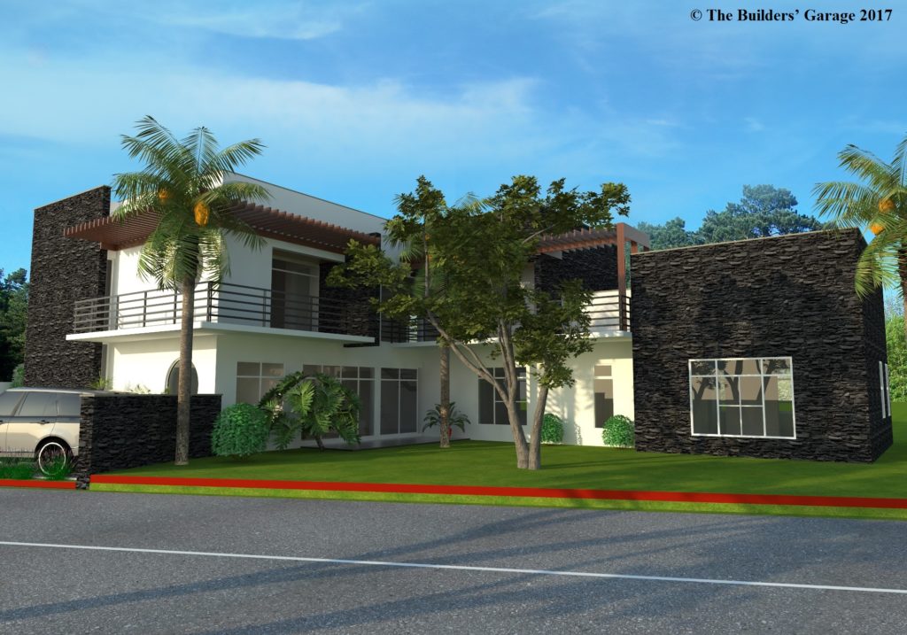
Figure 1: 3D image of the building – front elevation
During the construction of the foundation, the client had made a few changes to the original foundation. Before commencing the design for the interior spaces, the client suggested that I visit the site to understand of the changes he had made to the foundation and the impact the changes would have on the various interior spaces.
After the site visit, we agreed on the scope of work, the terms of payment and the timelines for completing the assignment. I was required to develop a detailed interior design scheme for about 12 spaces.
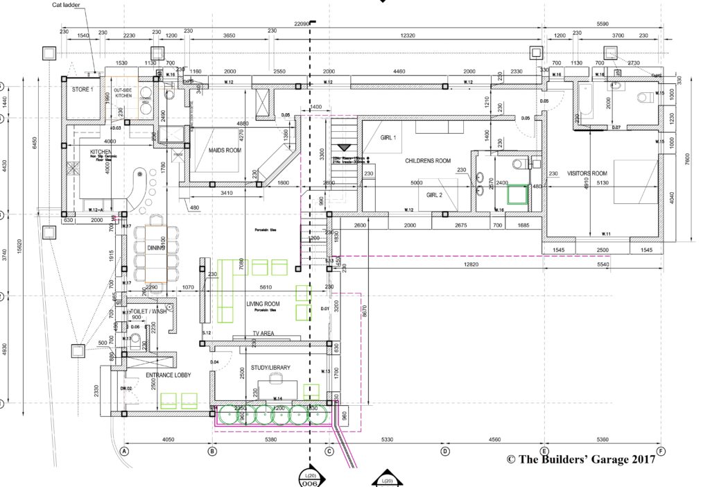
Figure 2: Ground floor
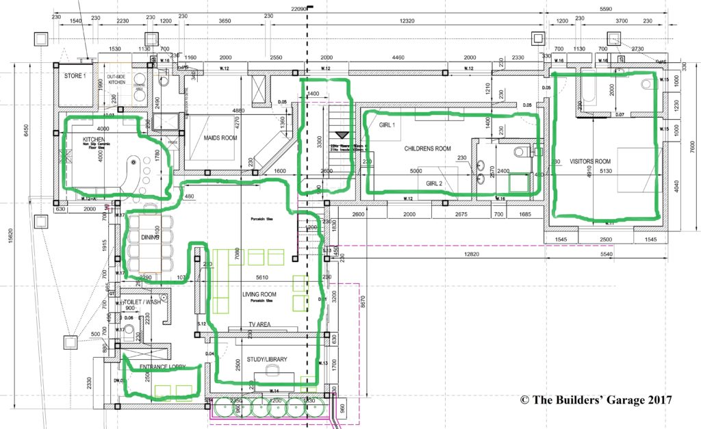
Figure 3: Ground floor interior spaces labelled in green
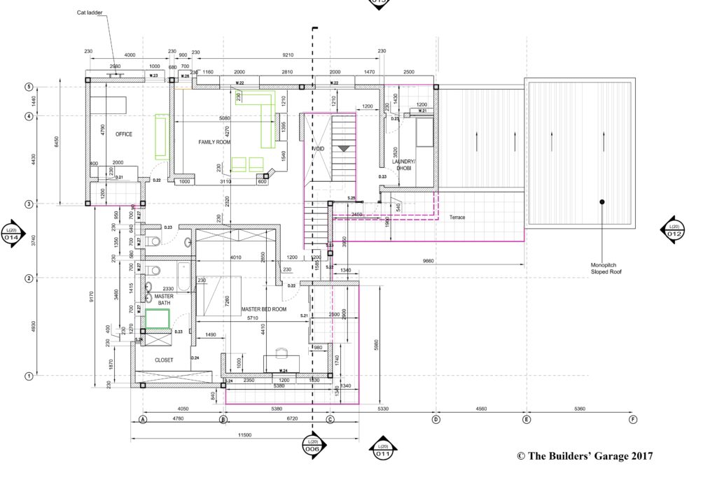
Figure 4: Top floor
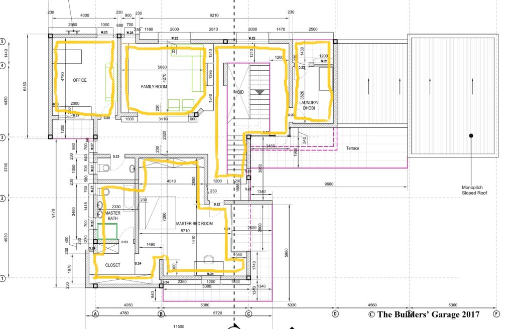
Figure 5: Top floor interior spaces labelled in yellow
Out of these 12 spaces, I will share with you how I went about developing the detailed interior design for three key spaces i.e.
- The Lounge
- The Kitchen
- The Staircase
For these three key spaces, how did the assignment progress?
Part A – Building up the 3D Models
From the architectural drawings which had been provided, I first developed a 3D model of the building so as to be able to see the spaces as the architect had designed them and begin to get a better sense of scale, perspectives, natural lighting and so on.
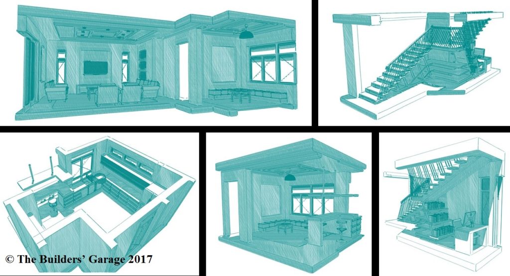
Figure 6: 3D models developed at the start of the assignment
Part B – Developing my ideas and concepts
The lounge
Contrary to the size of the house, some of the interior spaces seemed tight and difficult to navigate. For instance, the dining area had been situated in such a way that it conflicted with the circulation in and out of the kitchen and lounge, pushing the dining table into a corner. This left only one side of the table easily accessible to users, which side was itself in the corridor leading to the kitchen and lounge.
In order to improve the functionality of this space and its adjacent spaces (kitchen and lounge), I had to move the dining area to an alternative location along the central axis of the lounge. To define the corridor space in the new dining area, I provided a multipurpose counter adjacent to the dining space.
From a previous occupancy of 10, the dining area was now potentially able to accommodate up to 15 people and with room for people to freely move around the table and from it to and from the rest of the ground floor spaces. The original location of the dining was converted into a small second lounge attached to the kitchen. To increase the floor area in the main lounge, the study was eliminated; increasing the lounge space by approximately 12 square meters. The function of the study would be later incorporated into the now enlarged lounge.
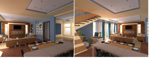
To accentuate the chief communal spaces of the house i.e. the lounge and dining, two defining feature walls were created at either end of the long rectangular space in which the two were located. One of these walls (where the television would be placed) was designed to be the main feature wall and the other the minor. It was designed to contrast its adjacent walls with a double extrusion to be finished in timber unlike the general smooth paint finish on the other walls. I did this to create a distinct focus point within the main lounge space.
For the second future wall, the client wanted something they could easily change from time to time, for example, it could have pictures for a season, then a large painting at another time, or decorative art pieces in another. I designed the wall to not only be able to change between these functions but to be a feature wall in and of itself before anything is added to it.
Relating it to the main feature wall, I again employed timber but on this wall. I used strips of timber spaced at equal intervals from one another. This gave the wall a unique texture made of paint and timber. The strips would also be used in future to support different types of hangings with minimal damage to the wall behind them.
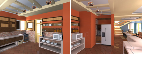
The kitchen
For the kitchen, I wanted to create something unconventional. I designed open overhead cabinets of various sizes and shapes, a double decker chest of drawers beneath some of the kitchen worktops and open storage space below other worktops. I also designed the levels of cabinets so that they were skewed against each other to create more visual interest. I used different colours of timber to create a new texture from the combination of the two. One of the timbers being light and the other dark to create accents.
The kitchen, lounge and dining form one of a house’s main batteries. The three spaces overlap in function and so I wanted them to overlap visually but also to have an overlap in circulation flow. Off the kitchen, I added a counter at which people in the adjacent lounge could sit and interface with the people in the kitchen. This counter was further aligned with the dining counter which functions as a broken off extension of it.
Within the kitchen space, there was a protruding beam in the ceiling that spanned the entire length of the space. This beam was part of the supporting structure for the overhead water tanks, which were to be placed on the third level of the building. This beam compromised the harmony in the visual compositing of the kitchen. To improve the aesthetics, I designed a similar false beam alongside it and a ribbed ceiling pattern between them into which the lighting system was incorporated.
From the original architectural drawings, the kitchen had been designed with an external store and an additional cooking area on the kitchen veranda. The outdoor kitchen was meant to use fuels such as charcoal and wood. These emit a lot of smoke that I wanted to keep out of the indoor kitchen while allowing the two kitchens to be used simultaneously nonetheless.
I therefore moved the inbuilt stoves of the outdoor kitchen to the outer wall where passing air could easily carry away the smoke. I designed the connecting door between the two kitchens to have a service window in its top half to enable the easy passage of food and other items between the two kitchens with minimal exchange of air between them.
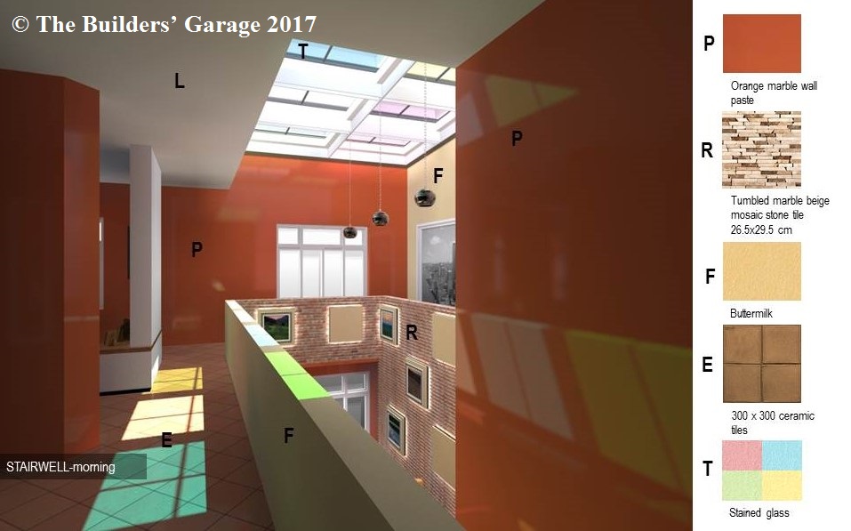
The staircase
The client wanted his staircase to be a feature in the house. He also requested me to introduce a skylight above the staircase that had not been included in the original architectural design.
The client’s proposal to introduce a skylight brought with it an opportunity to bring more natural light into the interior spaces as well as using this light to create different moods in the internal space depending on the sun’s position in the sky.
I used a combination of tinted glass with different colours on the inner side and tampered glass on the outer side of the skylight to provide a structure strong enough to withstand external damage while remaining aesthetically pleasing, becoming a feature in and of itself. I also introduced a vacuum in-between the two layers of glass to keep out heat while allowing light in. On the walls of the stairwell, I created a mosaic pattern using textured tiles (a composite of stone and glass). These tiles emit a different colour pattern from dawn to dusk.
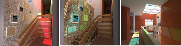
Seeking to utilise the space under the second flight of steps, I added a workspace where there was sufficient headroom. The workspace had enough room for a desk, chair and bookshelf. It was designed to face the main focal wall (TV wall). Under the landing between the two flights of steps, a provision for the storage of electrical and mechanical items was created underneath the first flight of steps.
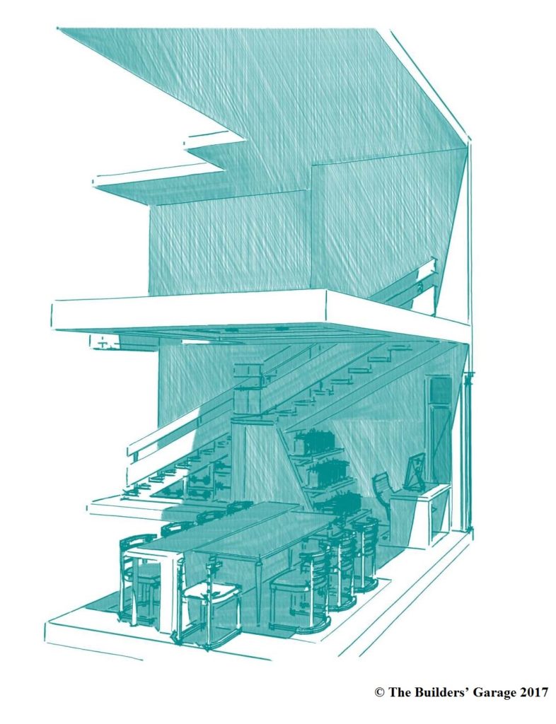
Figure 8: 3D model of staircase workspace adjacent to dining area
Continue to Part 2
©. The Builders’ Garage 2017. Permission to use this article or quotations from it is granted subject to appropriate credit being given to thebuildersgarage.com as the source.
Follow The Builders’ Garage on Facebook , like our page to receive updates and leave us a comment
Follow (connect with) the writer (Cyrus Titus Aomu) on LinkedIn